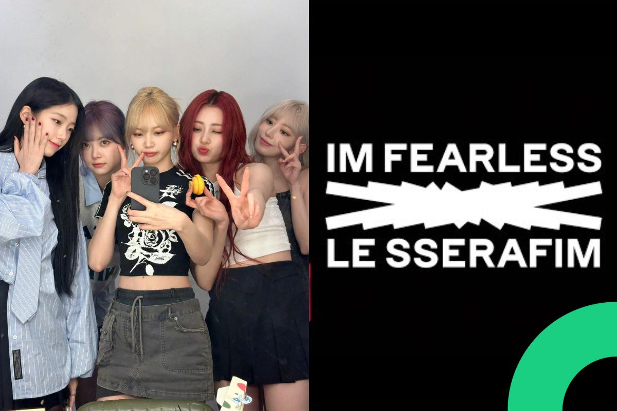
One of the most acclaimed elements of LE SSERAFIM’s branding is its logo—a minimalist yet impactful design that has captured attention not only within K-pop but also in global design circles. Developed by leading branding agency HUSKYFOX, the logo is much more than just a visual—it’s a bold statement of identity and intent.
The Hidden Meaning Behind the Logo
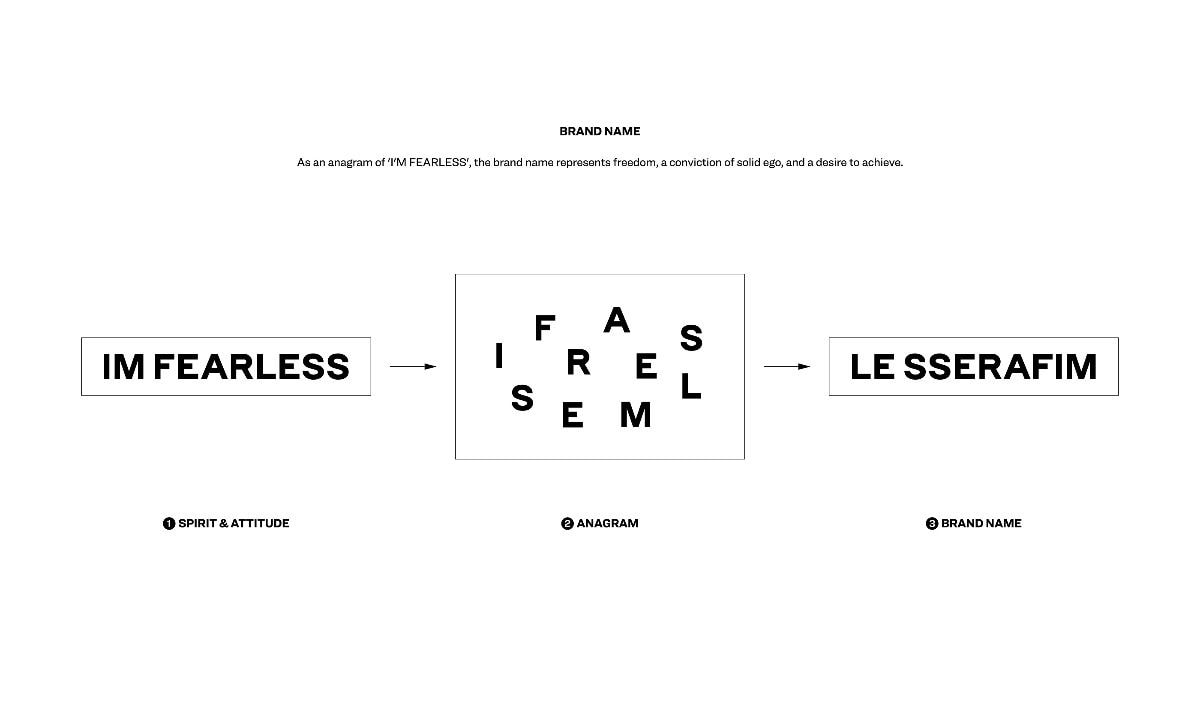
The group’s name “LE SSERAFIM” is a clever anagram of the phrase “IM FEARLESS,” which doubles as the group’s core slogan and message. This phrase embodies the group’s fearless spirit, confidence, and willingness to defy expectations. By rearranging the letters of “IM FEARLESS” to form “LE SSERAFIM,” the branding communicates the idea that fearlessness is not just an attitude—but a part of who they are.
From Phrase to Icon: The Design Process
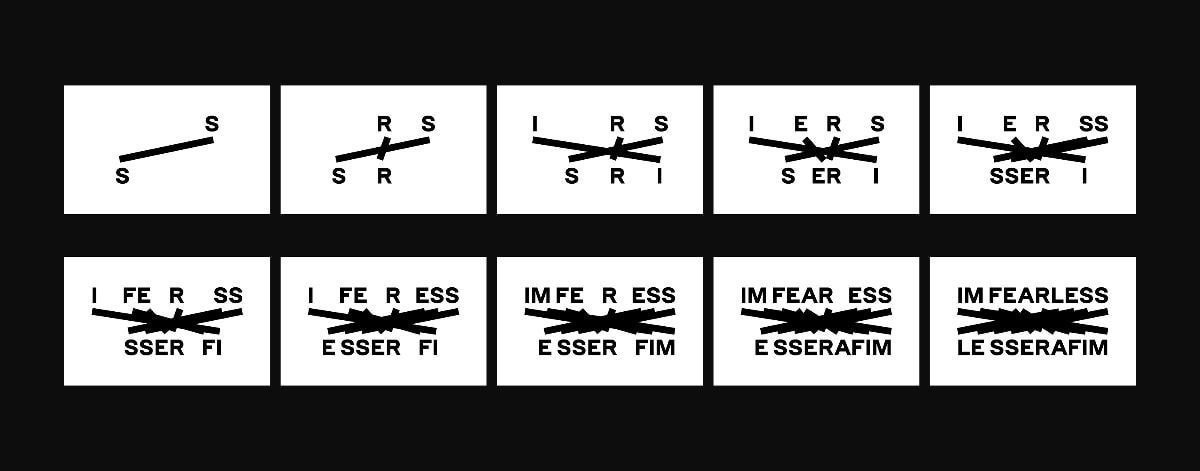
HUSKYFOX brought this concept to life through a logo that connects each letter of “IM FEARLESS” using precise, continuous lines—creating a shape that feels geometric, sleek, and modern. The outcome is a visual that is instantly recognizable, highly versatile, and deeply tied to the group’s narrative. Despite its simplicity, the line-based structure represents unity, direction, and forward motion, reinforcing the group’s image as bold, progressive, and unapologetically unique.
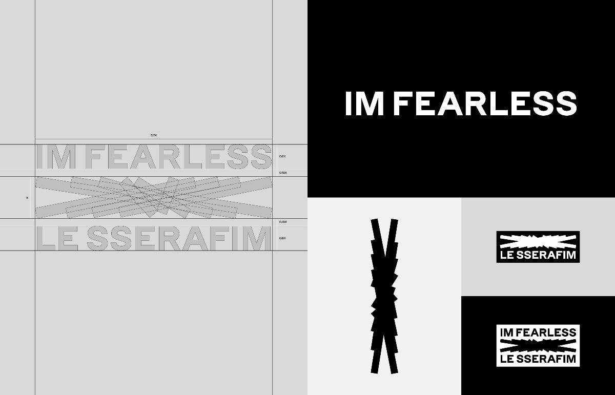
Because the design stems directly from the group’s core message, it resonates across everything they do—from their debut visuals to album promotions and global collaborations.
Global Recognition: Award-Winning Design
The brilliance of this branding did not go unnoticed. The LE SSERAFIM logo has won awards from two of the world’s top three most prestigious design competitions, underscoring its excellence in creativity, execution, and visual storytelling. These honors highlight not just the logo’s aesthetic appeal, but also its strategic alignment with the group’s identity—a rare feat in music branding.
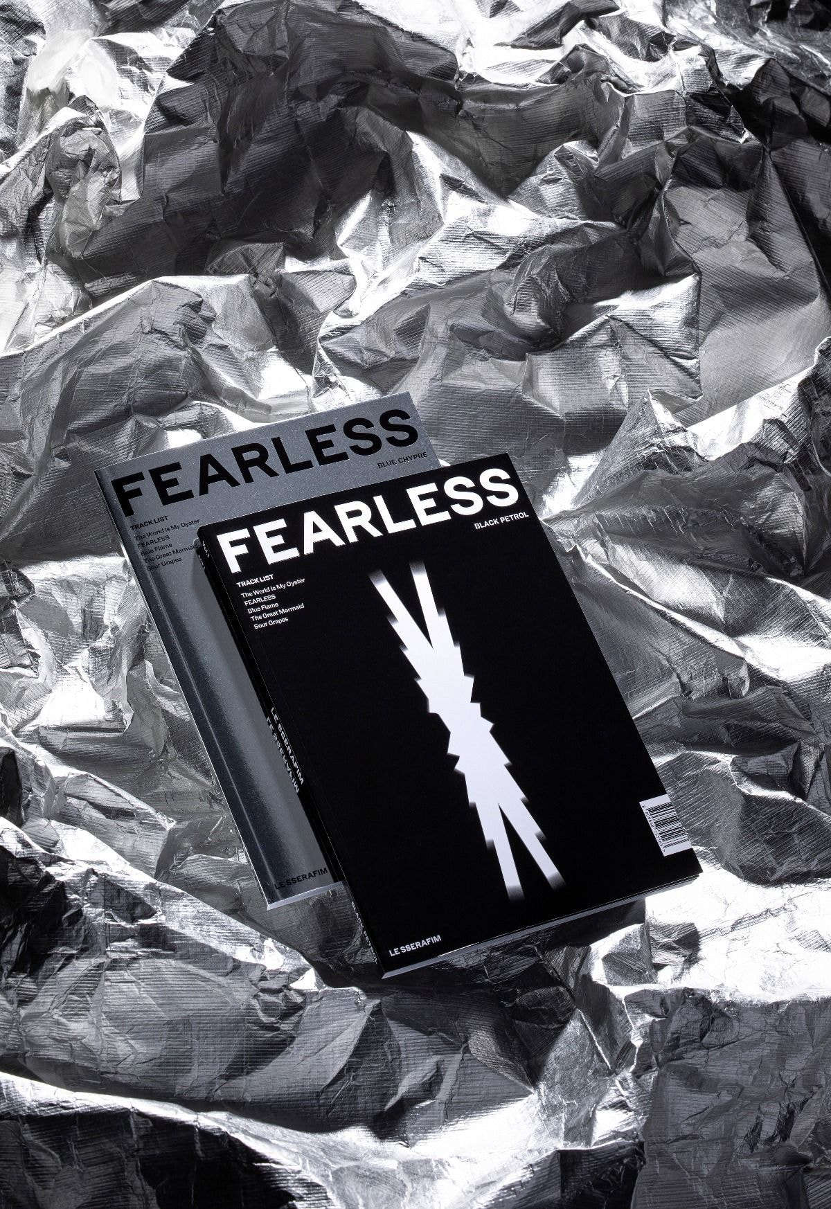
What further sets the logo apart is its versatility. Its clean, linear form allows it to be seamlessly adapted across platforms—from album packaging and merchandise to music videos and stage backdrops. No matter where it appears, the logo feels natural, modern, and visually compelling.
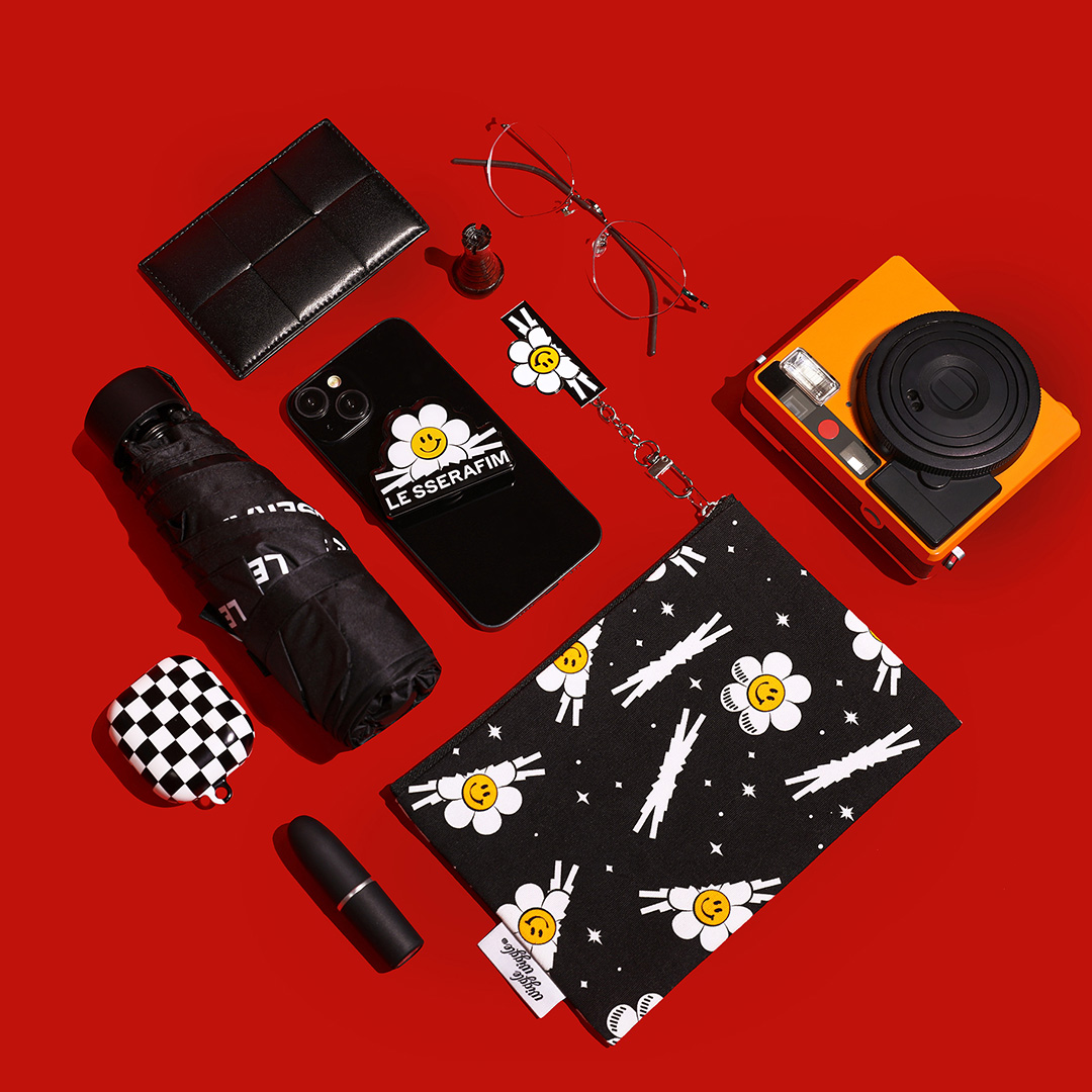
Additionally, fans have noted how each LE SSERAFIM album features a unique variation of the base logo—subtly evolving with each concept while maintaining brand consistency. This thoughtful approach makes the logo feel alive and responsive to the group’s artistic growth.
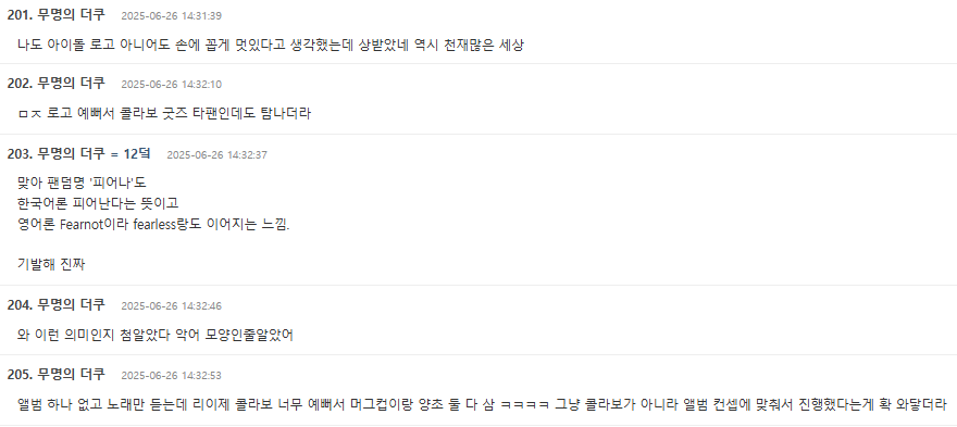
- I also thought it was one of the coolest logos—even without being an idol logo—and turns out it won an award. As expected, the world is full of geniuses.
- For real, the logo is so pretty that even as a non-fan, I really wanted the collab merch.
- Right, even the fandom name “FEARNOT” is clever. In Korean, “피어나” means “to bloom,” and in English, it’s “Fear Not,” which connects to “Fearless.”
- Wow, I just learned this for the first time—I thought it was shaped like a crocodile 😅
- I haven’t even bought an album and only listen to the songs, but the RE__JE collab was so pretty I ended up buying both the mug and candle 😂 You can really feel that the collab wasn’t random—it matched the album concept perfectly.
In a saturated industry where branding can often be secondary, LE SSERAFIM’s logo stands out as a masterclass in identity design. It’s more than just a symbol—it’s a fearless declaration of who they are and what they stand for.

